Jakuchu Ito 伊藤若冲 (1716~1800)
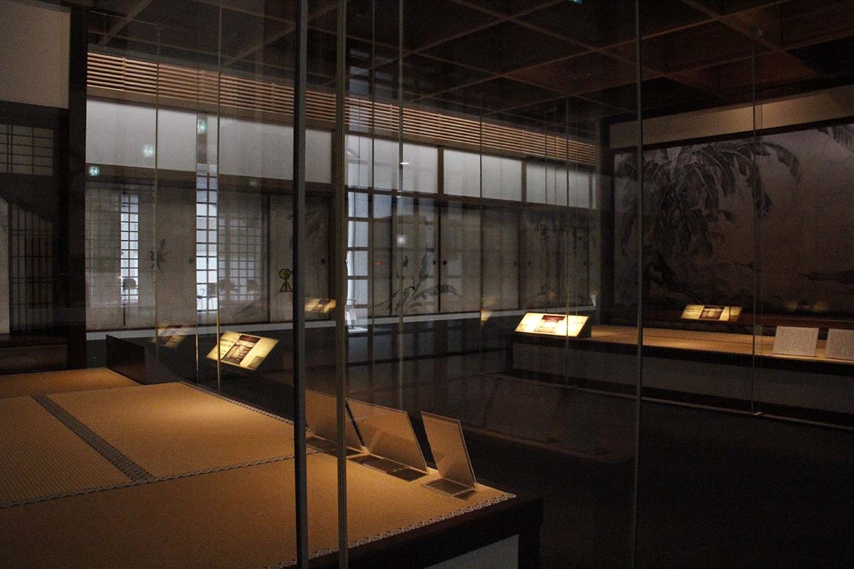
The other day we went to Jotenkaku (承天閣)Museum at Shoukoku-ji (相国寺)temple in Kyoto to see a special exhibit of Jakuchu paintings. In 2012, 33 of his paintings came to Washington D.C. and I missed it (I only got a catalog from the D.C. exhibit), so when I found out that this museum had this show going, I decided I just had to go see it.
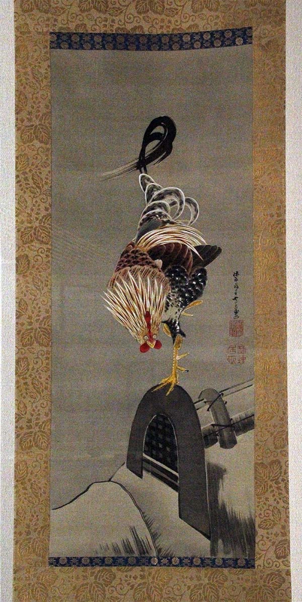
Shoukoku-ji had many well-kept beautiful gardens and we really enjoyed strolling around. Then we went into the museum to see Jakuchu's paintings. Boy, I wasn't disappointed. The colors, brush strokes, designs, everything I expected to see was right there and a lot more! The dynamic yet extremely sophisticated brush movements, control of ink and paint are just breath-taking. The sense of liveliness he injected into his subjects (birds, fish, or whatever they are) with a touch of humor was very entertaining and you'd never get bored. Nanette and I were just in awe and tried to soak up as much as we could before we had to leave.
I had a couple of art magazines on Jakuchu with me and they taught me how his paintings were made. I found out how innovative and experimental he was, trying new pigments, combining different painting methods, some of them were highly unconventional at his time. This really deepened my appreciation of his mastery.
I took a few photos of this exhibit (though no photos were allowed). The light was dim in order to protect his fragile paintings on silk, so I had to use a very high ISO setting on my camera and the pictures were very grainy.
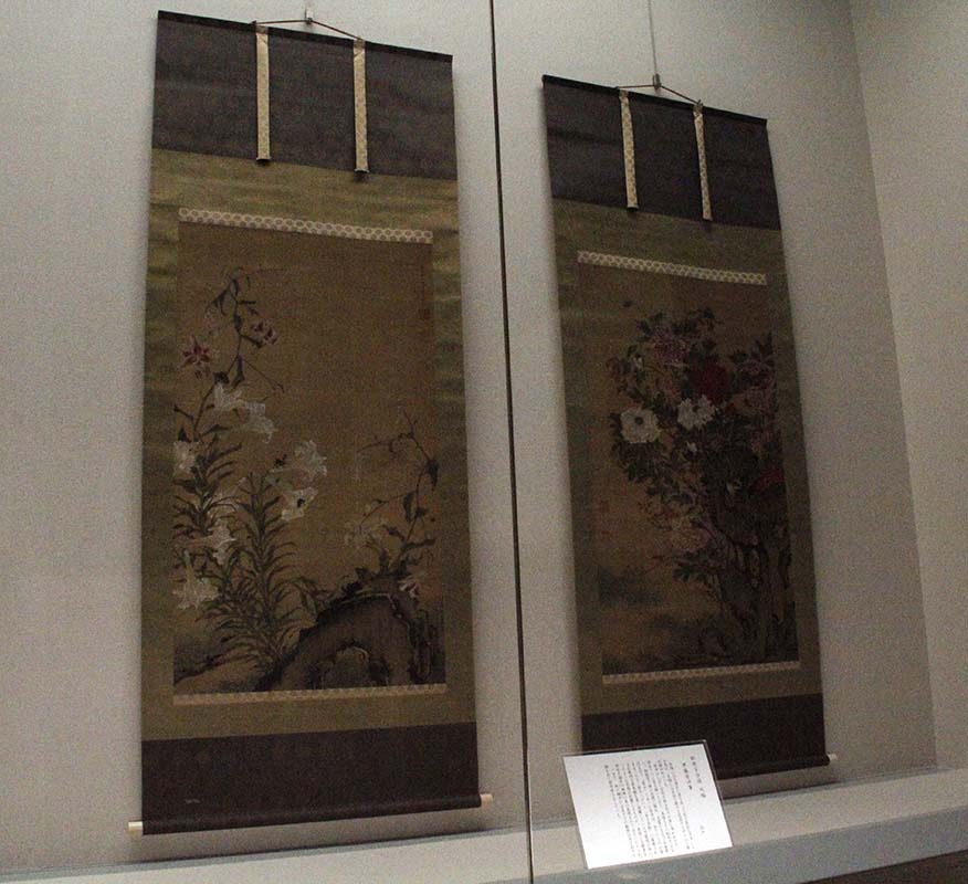
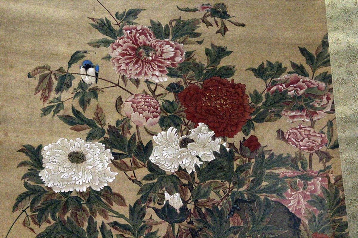
This is a detail of this tree peonies painting. He painted the leaves by combining 2 different painting materials: fabric dye for the wide parts of the leaves and pigments for the veins. He managed to create 2 different textures for this technique. He also applied flat colors on the back of the silk before painting the front side with more details. That way he could let the colors on the back peek through the woven fabric in a very subtle fashion and also the thick, built-up paint on both sides intensified the colors. The effect of this technique is more visible in the flowers and the bird in this particular painting.
He also used paper dyed in black sumi ink on the back of the silk for support. This black paper dropped the value of the parts of the silk that were not painted or thinly painted, and helped increase the contrast between the painted subjects and the surrounding negative spaces and at the same time intensified the colors of the paintings more. Just brilliant.
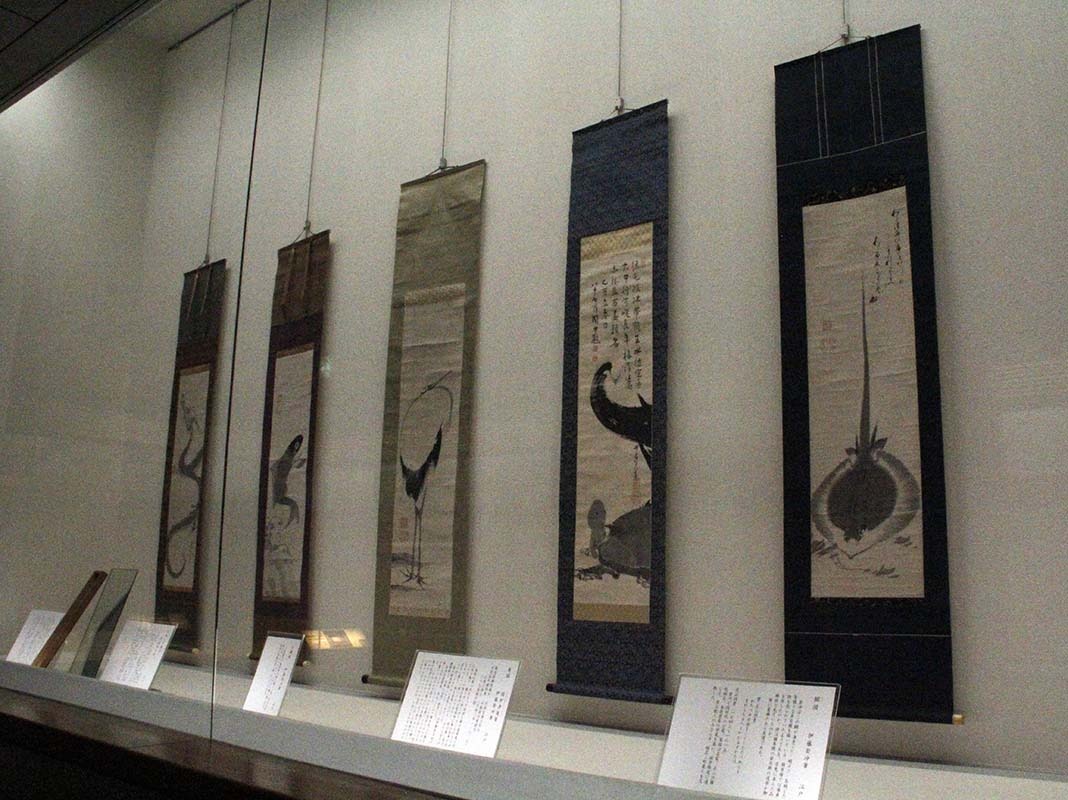
Some comical depictions of animals.
 Hiroshi Hayakawa