Blog Index
The journal that this archive was targeting has been deleted. Please update your configuration.
Navigation
Thursday
Jan142021

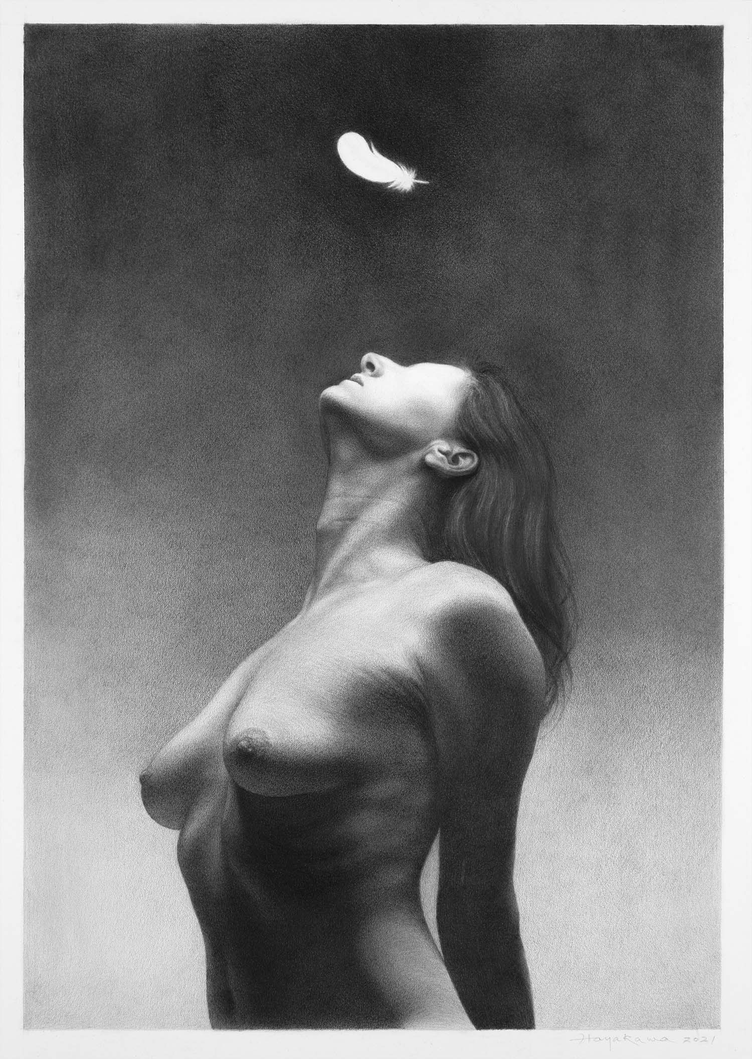
Vanias 26 finished! (01-13-2021)

Today I finished the drawing "Vanitas 26". I decided not to add any detail or texture to the falling feather. Better that way because it visually unites the blank feather with her face where her eye is absent, and the lack of texture creates an illusion of "glow" as if the light from above went through it and hit her face. Initially I was thinking about working on a wider composition, almost square with lots more feathers floating in the air, but I decided to take a minimalist approach drawing only one feather. I think my decision was sound. Why do you need to use a whole bunch of the same stuff when you can say what you want to say even more effectively with just one?


Sunday
Dec272020

Vanitas 25 update (12-27-2020)

I have been working on this newest piece that is going to become "Vanitas 25". I am reusing the background I had used for "Vanitas 22" for this one. I just love the texture of the wall and I thought I could take an extra mileage out of it. I was also inspired by the fact that Kent Bellows used the same backgrounds for multiple pieces.

Sunday
Nov082020

Strokes of Genius 12 Out!

I received early copies of Drawing Magazine Strokes of Genius edition in the mail. I am honored to be included in this publication 2 years in a row, It really validates my effort of trying to accomplish something in this field of artistic expression. 

Friday
Nov062020

ARC Salon Semi-finalist!

My submission of 2 drawings to this year's Art Renewal Center Salon competition got chosen after the semi-finalist judging. I am honored to be included in the good company of fantastic realist artists I so admire.


Monday
Oct122020

New Vanitas drawing begins!

I started this new drawing yesterday. The original photo reference was a B/W image on a medium format film I took over a decade ago. I intended to use this image for printing on sheet metal using liquid photo emulsion back then, but I never did. With that process in mind, I intentionally over-exposed and over-developed this negative 2 ~ 3 stops in order to increase the image contrast. When I test printed this image, the highlight (her face) was unfortunately way too dense and I could not see any textures in there at all. I thought about using this image as a reference for a drawing a couple years ago, and I tried my best to bring back highlight textures in Photoshop with not much success. So I almost gave up on using this image. I reshot its new versions with different models a couple of times and tried to recreate the shot but I could not get the new images close enough to this original which was truer to my vision. So I finally decided to use this old original image as a reference with its warts and all. I am thinking about not drawing her eye at all, and am hoping, by doing so, I might be able to make her face look luminous. Will see...